Beauty beholden and beheld
I saw Iron Man 2 last night…
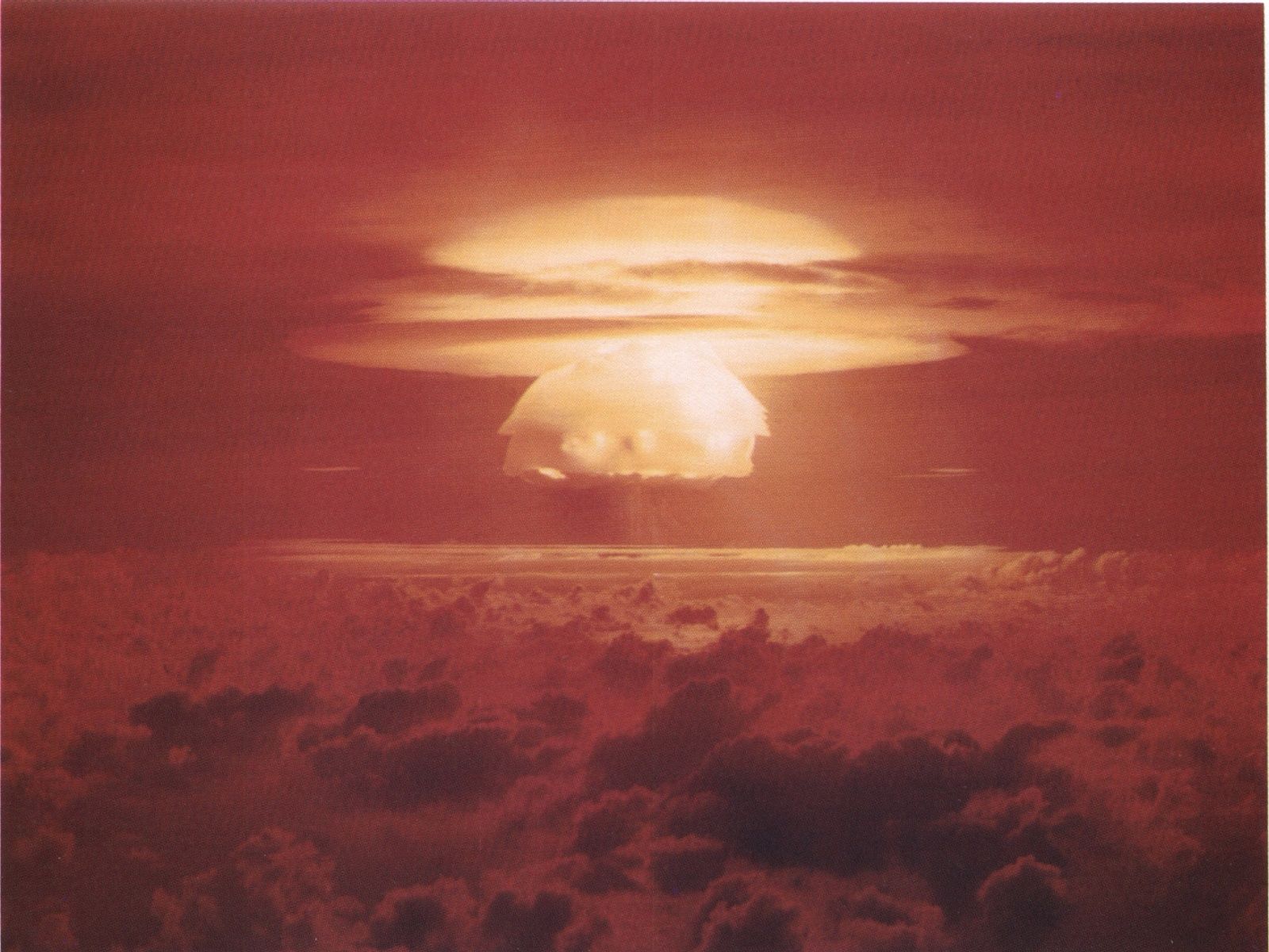
 …but rather than give a two-weeks-late-to-the-party review, I’d like instead to focus on the scene depicting Stark Expo ‘74. In the first place, they were off by about 10 years–the aesthetics of that scene were lifted straight from Walt Disney’s Epcot promos, and while the park didn’t begin until 1978; the promo film Jon Favreau wonderfully stole was Disney’s 1966 introduction to the Epcot Plan. The “work here, live here, play here” designs of today’s urban renewal projects look like lipstick on a mixed-use chicken compared to the underground roads, automated people movers, and nuclear powered hair salons of Disney’s fabled tomorrowland. I know it’s been said before, but really, 40+ years later, where’s my fucking jetpack?
In the second place, I will never stop loving the optimistic aesthetic of the post-Kennedy 1960s. Nothing says “Don’t worry; things are getting better! Tomorrow will be great, next week amazing, next year unimagiable!” quite like white plastic countertops with tangerine and lemon appliances.
Building upon the atomic-era kitsch-style of the 1950s, refining the passive Formica patterns boomeranging around barely understood physics, beyond the naivety of McCarthyist optimism came the hyperreal idealism of the 1960s. That bright, glowing, everywhere-can-be-Florida look that congealed a decade later, heralded by Tang and other artificial living. An aesthetic that triggered science, a look that compelled exploration; rather than providing just a limp metaphor for emotion, the color swatchbooks of the 1960s worked to actively trigger those emotions.
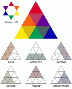
For example, take a look at Josef Albers’s 1963 Color Harmonies paradigm. As Albers understood, “feeling blue” isn’t just sadness, it’s melancholy and serious and reflective. Or, looked at another way, when I’m melancholy, I may also be a little bit serene, serious, reflective, or even mighty, but I won’t be lucid. If I think I’m feeling both melancholy and lucid, I’m not—I’m serious or reflective, instead. Sounds about right, doesn’t it?
But that was a paradigm for 1963; that was how things worked in a just-after-Camelot duck-and-cover world. In today’s world we have a different sense of beauty, a stranger brand of optimism, a more sophisticated way to feel. It’s not only new words like “disordered, dysfuncitonal, and dysemic” that we need for these awkward new feelings, but wholly new shades of rose to color our glasses; a Pantone Matching System to accompany the DSM-V; a new way to process the colors of our lives.
Colorformatics: Précis on Color as Information
You’re afraid of the dark (or at least you used to be). But why? What’s waiting for you in the dark? Is it the primordial beginning trying to reclaim you? The fairytale forest hiding wolves and ogres that want to eat you? The urban legend backseat where a man with a hook waits to maul you? Maybe. Or maybe the dark is more basic than all of that. Maybe, I would like to suggest, the dark is nothing but a simple lack of information, and our fear nothing more than cautious erring in a low-information situation.
If the color—the space, the emotion, the mood, the condition—of low-information content is black, then it’s corollary—white—is the color of input, the color of information, the color of data, the color of light.
City night streets after a torrent of rain; the pavement is slick, puddles and miasmas of wetness abound. Each drop collects, reflects, and refracts the little light that’s available, doubling, tripling, n-tupling the red of the stoplight, the halogen coral of the street lamp. Each drop multiplies the mid-century-modern data of the scene. At times there’s so much reproduced information that a cacophony of light erupts; too much to see, too much to take in, too much to process.
This is the basic dichotomy, the balance between everything and nothing, information available and wanting. As light becomes dark, as white gives way to black, we need a new vision of the color wheel to capture this emotional infotech chiarascurro. And thanks to the wonders of blog-world, I think I’ve found it.
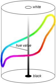 Although based on Nemcsics’s 1974 Coloroid Model (left), the 2001 Revised Color Wheel of an anonymous blogger from a decade ago (right) has really captured my heart. This weird graphic is surely the way I feel, the semiosis for my infinite being. This isn’t just a pretty picture or a color-theory dorkathon, but a whole new way to think about the metaphors we live by.
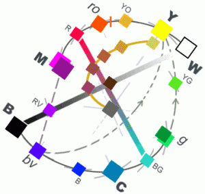 Looking at the unnamed blogger’s Escherian stairway of color you find you’re “green with envy” precisely because you have a lot of the information for a given situation, but not enough to understand the truth (and, depending on how much you know or don’t, your envy takes on shades of feeling yellow or blue…). The “purpled royalty” live woefully uninformed about the ways of life of the peasants you lord over. The bright orange traffic signs provide exactly the information you need—Caution!—but no more, while the red of a stoplight tells you to learn more before you continue. The red of anger, likewise, is born of knowing 100% of your side of the story, but almost none of the other side. And what about those cases where you’re suffering from a surfeit of information—knowing nearly but not quite all? You grow yellow with cowardice in times when all you lack is knowledge of the outcome, while if you know so much that your mind can’t let you sleep, but not quite enough to reach the white light of nirvana… well, that’s what the yellow wallpaper is all about, isn’t it? And there in the middle, the compass rose pointing to all the other colors, is the silvery gray of a mirror; giving back exactly the information put into it, no more, no less.
And me? I’m almost in the dark. I know where I’ve been, but not where I’m headed. I don’t know if what’s happened before will help, hinder, or even be applicable to what will happen next. I don’t know what I’m supposed to think; I don’t know how I got here; I am lacking information. That is, I’m feeling blue.
More slices of the aesthetic wheel
![ProvocativePercussion4[1]](http://dsbigham.net/blog/wp-content/uploads/2010/05/ProvocativePercussion41-150x150.jpg) This post was kicked off by my recent purchase of Enoch Light’s Provocative Percussion vol. 4, with a cover design by Josef Albers.
This post was kicked off by my recent purchase of Enoch Light’s Provocative Percussion vol. 4, with a cover design by Josef Albers.
Though, really, Suzanne Vega’s Night Vision would have been equally appropriate.
A thorough Googling of Josef Albers came up with these two most informative posts:
A review the Hirshhorn Museum’s Josef Albers exhibition on Artblart & DesignBloom’s summary of Albers’s stained-glass windows exhibit at Musée Matisse. Looking at Albers’s stained glass in light of Colorformatics, we see the black and white bars become the request and dissemination of information, a conversation against the backdrop of a certain mood.
The Handprint website? blog? course-notes? of an unknown author (Benet?). This is where the 2001 Revised Color Wheel comes from. I am deeply indebted to this unknown writer.
The Tecta products page… marketing desk lamps inspired by Albers.
A wholesome dose of beautiful retro-futurism from the Formica Corporation. Click on the typewriter icon and go to Retro Gallery. It’s well worth it.
And finally, the cartoon that really formed my aesthetic mind, Bugs Bunny’s Hare-way to the Stars:
